
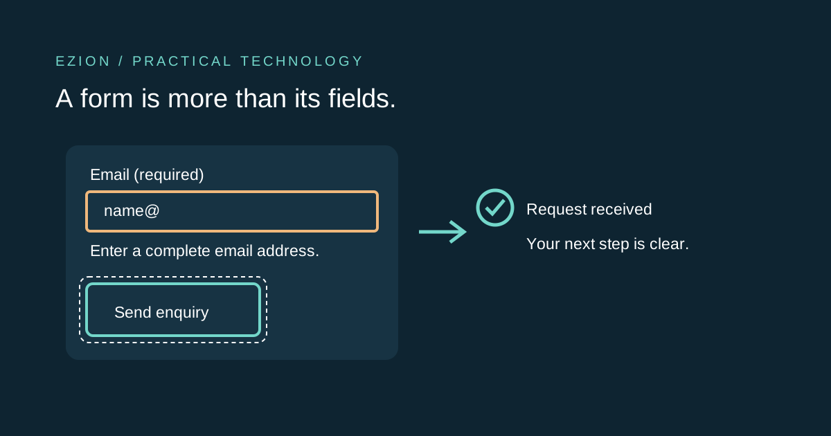
Design the whole submission journey
- 1 · Understand
Ask only what the task needs
Use clear labels, grouped controls and instructions that explain the requested information before a person starts typing.[1]
- 2 · Correct
Make the error actionable
Name the field, describe the problem and explain the correction. Associate the message with its control and provide a route back to it.[2]
- 3 · Confirm
Explain the actual outcome
Tell people whether the submission succeeded, needs correction or could not be confirmed. Feedback is part of the form, not an optional toast.[2]
Start by removing unnecessary questions
An enquiry form rarely needs the information required for a full customer account. Ask which fields are necessary to complete this specific task and remove the rest. W3C’s forms tutorial recommends short, simple forms and warns that excessive or irrelevant requests make abandonment more likely; it does not promise a particular conversion uplift.[1]
For an illustrative consultation form, a reply address and a useful description may matter more than a compulsory job title or postal address. Explain why any sensitive information is needed and offer a suitable alternative where possible. Less collection reduces both effort and the information the organisation must protect.[1]
Use native controls and persistent visible labels
Associate each control with a visible label using HTML label and matching id attributes. Group related options with fieldset and legend. A placeholder is a hint inside an empty field, not a durable label: it disappears when a person types and should not carry the only instruction.[1]
Prefer native inputs, buttons and select controls before custom widgets. Use a suitable input type and autocomplete token where appropriate, but keep server validation because browser checks can be bypassed. Ensure the visible wording is also represented in the accessible name so speech-input users can refer to the control they see.[1]
Explain constraints before rejecting input
Mark required and optional fields in text, explain unusual formats next to the field and connect the instruction with aria-describedby when needed. Do not rely on colour alone. A person should not have to submit a form to discover that a phone number needs an undocumented country code.[1][2]
Be cautious about validating every keystroke. W3C notes that some values, such as dates, are naturally incomplete while a person types. Choose a sensible validation point and preserve entered values after an error, subject to security needs. Avoid an overstrict pattern that rejects legitimate names or addresses just because they differ from the designer’s examples.[1][2]
Give errors a location and a repair path
Replace “Invalid input” with a message that identifies the field and suggests the correction. For several errors, provide a prominent summary with links to the affected controls and inline messages beside them. W3C shows associating field-level errors through aria-describedby; aria-invalid can additionally identify a field in error.[2]
Manage focus deliberately after an unsuccessful submission: move it to a useful summary or the first invalid control, not to an unrelated banner. For dynamically inserted feedback, use an appropriate live region or alert so assistive technology can discover it. Avoid announcing the same message repeatedly through both unnecessary focus changes and multiple live regions.[2]
Do not show success before the server accepts the request
A disabled submit button and spinner are only a progress state. Show success after the server confirms the operation your message describes. “Request received” is more accurate than “Email delivered” when the system has only queued a notification. Preserve a reference number when the workflow provides one.[2]
Plan for an uncertain result: the server might save the request while the browser loses the response. Do not encourage blind resubmission if that can duplicate a booking or charge. Use an appropriate idempotent submission design or a status-check and support path. This is an engineering recommendation for reliable feedback, not a claim that visual accessibility alone solves duplicate processing.[2]
Test the journey, not just the empty screen
Use a keyboard to reach every field, submit invalid data, follow an error-summary link, correct the value and complete a safe test submission. Check focus visibility and logical order. Test a narrow viewport, zoom, long translated labels and both error and confirmation states. Where possible, test with a screen reader and users of assistive technology.[1][2]
Automated checks can find some missing labels and invalid attributes, but they cannot confirm that the questions are understandable or that the announced result matches what the server did. Record what was actually tested and leave unsupported claims out of an accessibility statement. This checklist is a starting point, not a complete WCAG conformance audit.[1][2]
- Every control has a meaningful label that remains visible.
- Errors identify the problem and a way to fix it.
- Keyboard users can recover without starting again.
- Progress, failure and confirmed success are distinguishable.
- No production enquiry or payment is created just for an automated test.